|
I created 15 different logos that represent me. The first logo that I chose was the Bold lettering of the R with the detailed crown on top. The second logo that I chose was the more simple version of the R with the crown on top. The third and final logo I chose was the two R's back to back. The two symbol's with the R with the crown on top represent that I am precise, a perfectionist and creative. The third symbol is something that I think will be easy to shrink and expand and will be very recognizable. When I was creating these designs, I was a little frustrated since it was coming out how I wanted it too, but eventually I got more ideas and became less frustrated. 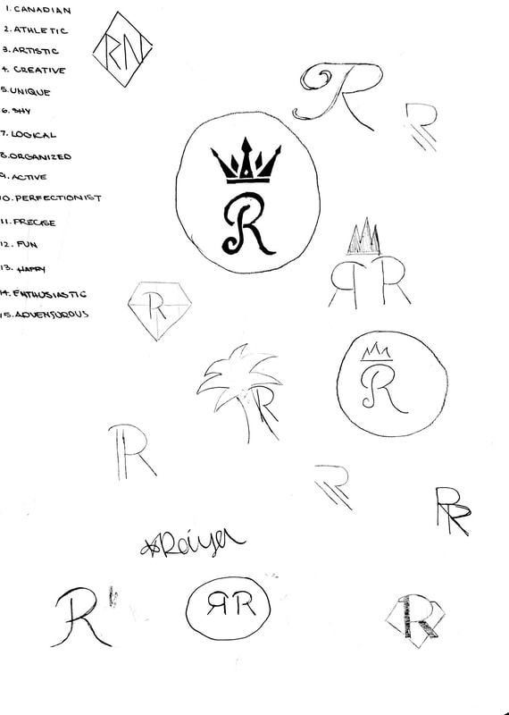
0 Comments
Leave a Reply. |
Archives
February 2019
Categories This work is licensed under a Creative Commons Attribution-NonCommercial-ShareAlike 4.0 International License. |
 RSS Feed
