|
Typography is using different font types to make written language distinct, readable, and engaging when displayed. Typography is important because whatever fonts and sizes you use effect whatever you are working on. Whether preforming a presentations or creating a product website the typography matters. "Each font has a personality and a purpose." This means that every font you use represents something and it does matter what font you decided to use. You want the audience to be able to read what you wrote, she want to read more and it should be colorful. Typography allows you to highlight important things and main ideas. Many designers use typography when creating a movie poster, the title has to be big and readable. The font of the title has to also be related to the movie. The actors in the movie aren't written as big because they are less important and are not the main focus. Overall Typography is important when doing anything! In class we learned about Serif, San Serif, Monospaced, Script/Handwritten and Novelty fonts. Serif fonts are fonts that are used more when writing large paragraphs and are usually used in print. Serif fonts have "feet"which are lines at the bottom of the letters. The font I am using write now is a Serif font. The next type of font is Sans Serif. Sans Serif fonts are usually used for heading and small blocks of writing. Sans serif fonts unlike the serif fonts do not have "feet." Another type of font I learned about was Monospaced. When writing in monospaced each letter takes the exact same amount of space. They are better for titles and not large amounts of text. This type of font is usually used in coding because it looks neat and it is easy to read. Handwritten/ Script is my favorite font and is the 4th type of font we learned about in class. Script fonts include cursive, calligraphy, or handwritten. They are sometimes hard to read, cursive especially because of all the loops. These types of fonts are usually used for titles, headlines and are very detailed. The last type of font is Novelty. Novelty fonts are fun and peculiar fonts. Novelty fonts are very easily spotted because of the unique designs. They are not good for large amounts of text but are good for adds, and headings. Typeface ComparisonIn the typeface comparison assignment we were supposed to show our understanding of the 5 different types of fonts and become comfortable with typography. For this assignment we were supposed to find examples of each of the 5 fonts, give an example text of the font, and write the fonts name. We had to be able to tell each font apart and know what category they fit in. We also had to be able to space out everything evenly, and correctly. As you can see below I had the 5 different types of fonts, I wrote the name, I made an example of the font and I spaced everything out evenly. 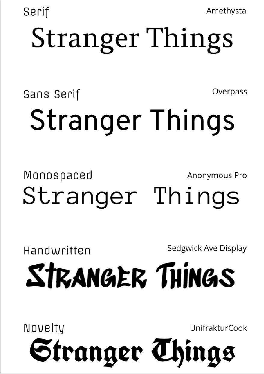 Word PortraitsIn this assignment we were supposed to get comfortable with the Type Tool, explore font options, and choose fonts that give meaning to text. We had to choose a font, write a word that matched the font and a word that opposes the font. We had to do this for 10 different fonts. The document we created it on had to be A4 sized, the layout had to be neat and creative, you had to label each font, and get it approved by the teacher. We also had to make sure that it was spaced out correctly and looked neat enough to submit. 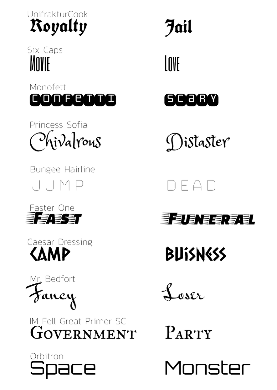
0 Comments
|
Archives
February 2019
Categories This work is licensed under a Creative Commons Attribution-NonCommercial-ShareAlike 4.0 International License. |
 RSS Feed
