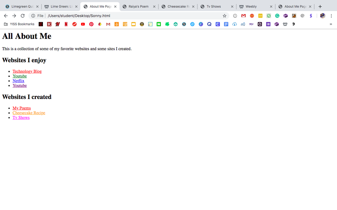
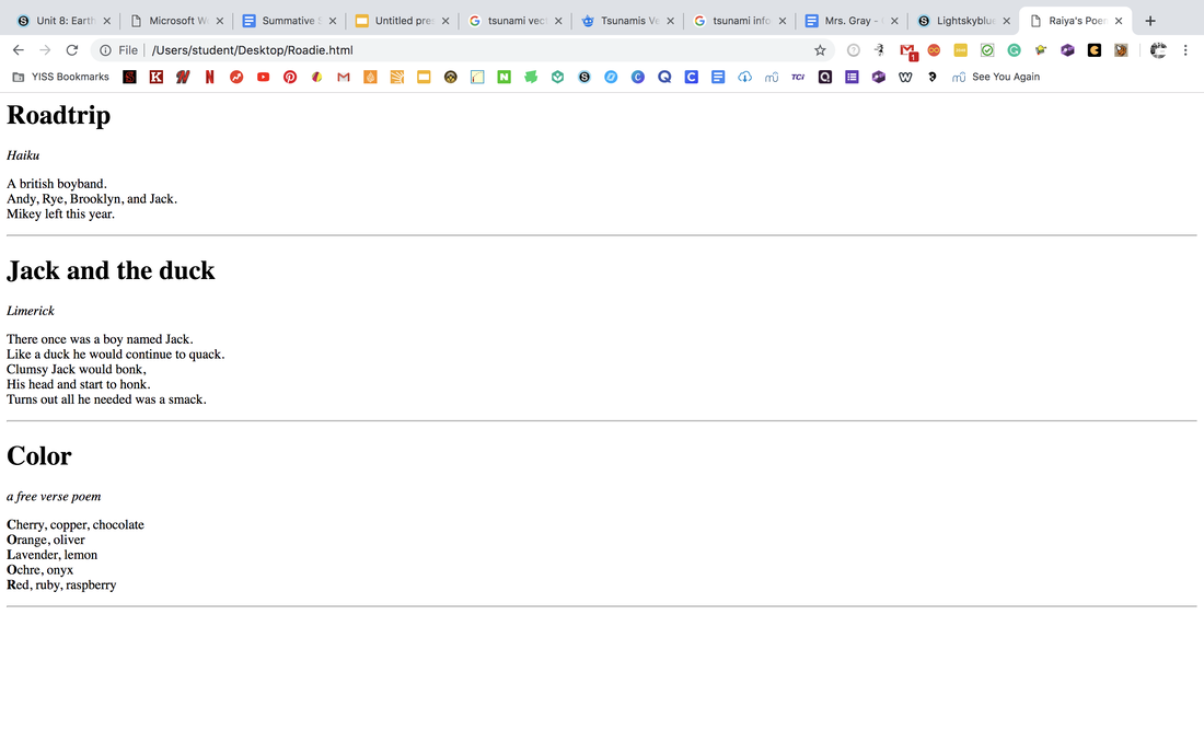
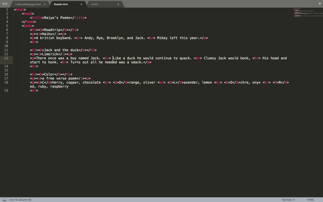
  This was more challenging than the other webpages I created but that made it fun. For this webpage I had to pay more attention and be more focused. I enjoyed the process. This is the link to my neocities site, About Me.
0 Comments
  I really enjoyed doing this. I think that I am getting better with coding now. I am happy that we get to do this.
  I liked that there was no instructions for this because it was more of a challenge and more fun. I hope we do more things like this in the future.
I really enjoyed creating this webpage. As I added more tags, I got more comfortable creating the website. I am exited to keep creating websites and getting better. 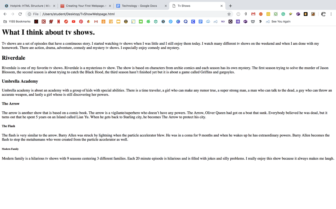 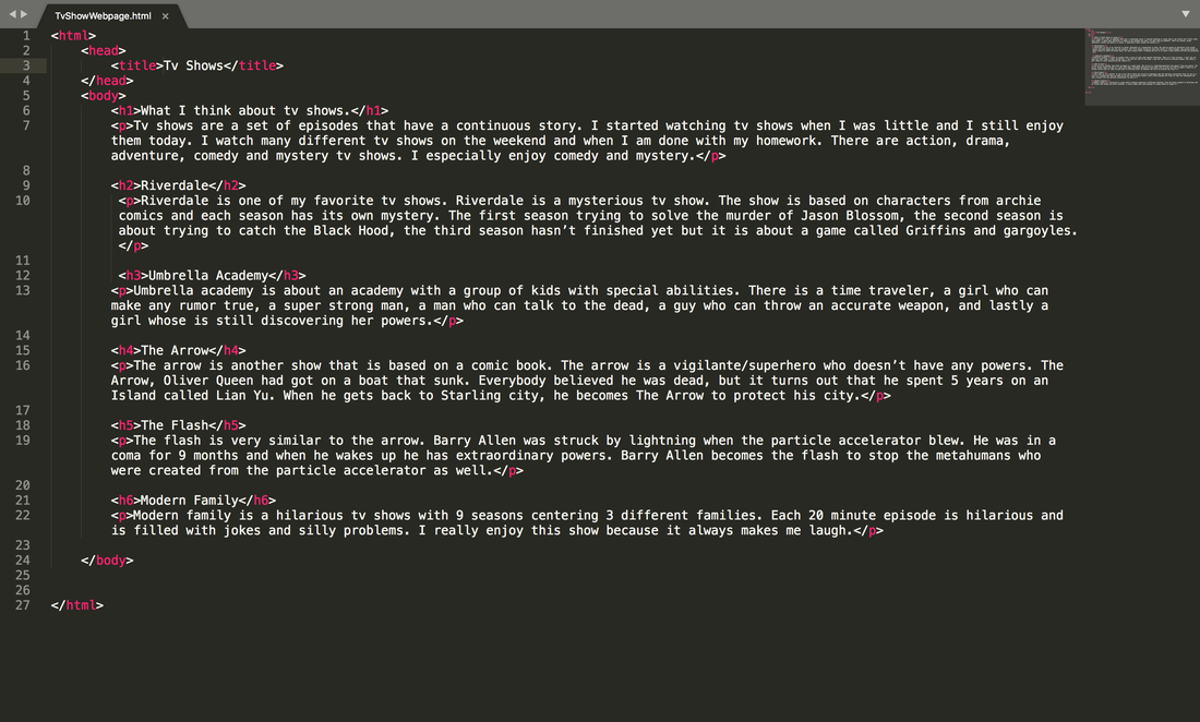 For this portion of the assignment we were asked to choose 3 different logos, and make different variations of them. When I was creating these logos, the most challenging part was coming up with different variations of each logo. When creating these logos, I used an image of a diamond as a reference. It was also hard for me to decide what type of colors I wanted for my logo. I really enjoyed the whole process of this assignment because I enjoy designing. The best part of the design process though was creating different variations because it was challenging and fun. From this experience, I learned how to change a design to make it look different and unique. This project was very fun and challenging at the same time. 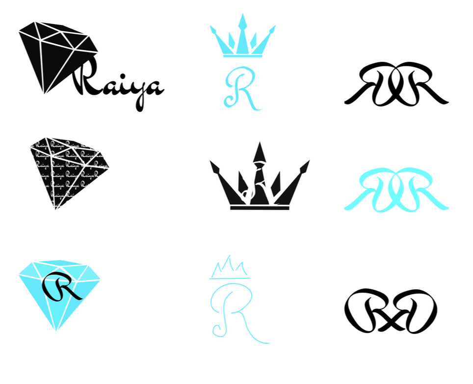 The name of my brand is Raiya and it is a brand for me. I decided to create this logo for myself because I though that it would be interesting. The purpose of my brand is to represent me. The logo I chose represents my brand because it shows the first letter of the brand's name. I decided to put the letter R two times because I thought that it would be a better representation than just a single R. I chose this logo because I thought that it would be easily recognized. I thought this logo was simple enough that it could be printed either big or small. Creating this logo was enjoyable and I think that this logo would be a good choice to represent my brand. 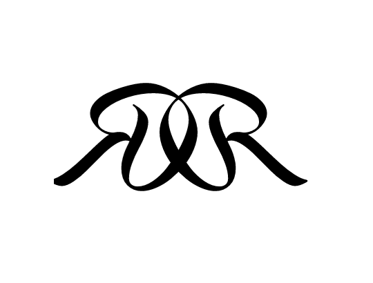 I created 15 different logos that represent me. The first logo that I chose was the Bold lettering of the R with the detailed crown on top. The second logo that I chose was the more simple version of the R with the crown on top. The third and final logo I chose was the two R's back to back. The two symbol's with the R with the crown on top represent that I am precise, a perfectionist and creative. The third symbol is something that I think will be easy to shrink and expand and will be very recognizable. When I was creating these designs, I was a little frustrated since it was coming out how I wanted it too, but eventually I got more ideas and became less frustrated. 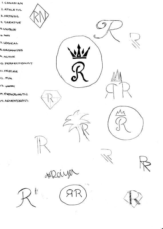 For this assignment we were asked to create 4 different color schemes, monochromatic, complementary, analogous, and triadic. For this assignment we used Adobe Color to create these different schemes. Then we were supposed to create a shape and color them according to the color schemes. We had to label the group the colors belonged to and label the Hex Codes. The 4 color schemes we discussed in class were Monochromatic, analogous, complementary , and triadic. A Monochromatic color scheme is a color scheme that is based on only one hue. In this color scheme it uses different saturation and brightness levels to create distinct colors. An Analogous color scheme is made up of different hues that are next to each other on the color wheel. A complementary color scheme is the colors from opposite sides of the color wheel. A triadic color scheme combines three different colors that around the color wheel that are evenly spaced. The Monochromatic color scheme is definitely my favorite color scheme because it uses the same hue and I really like that they are different shades of the same color. Another thing I like about the Monochromatic scale is that the colors all blend together well and it creates a really nice look. To create this art piece, I first traced an image of an tribal fox head. Then after that I used the Adobe Color wheel to create the 4 different color schemes. Than I changed the fox according to the color schemes. After that I labeled the groups and wrote out all the Hex Codes. At the end, I aligned everything properly and got approval from the teacher to continue. 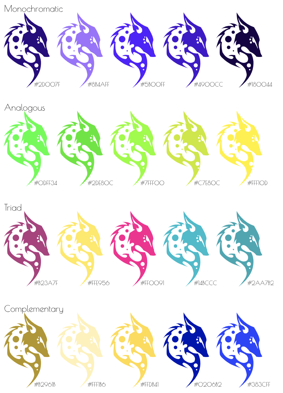 I created this image because I really like Lions and I thought that this image would work well for this project. To start off this project, I traced the image of the lion using a pen tool. Then I made a box next to the lion to put in the Hex Code and the RBG values. I grouped this image and copied and pasted it. Then I changed the color, the Hex Code and the RBG value. I did many different shades of the same color because I thought that it would look interesting and nice. 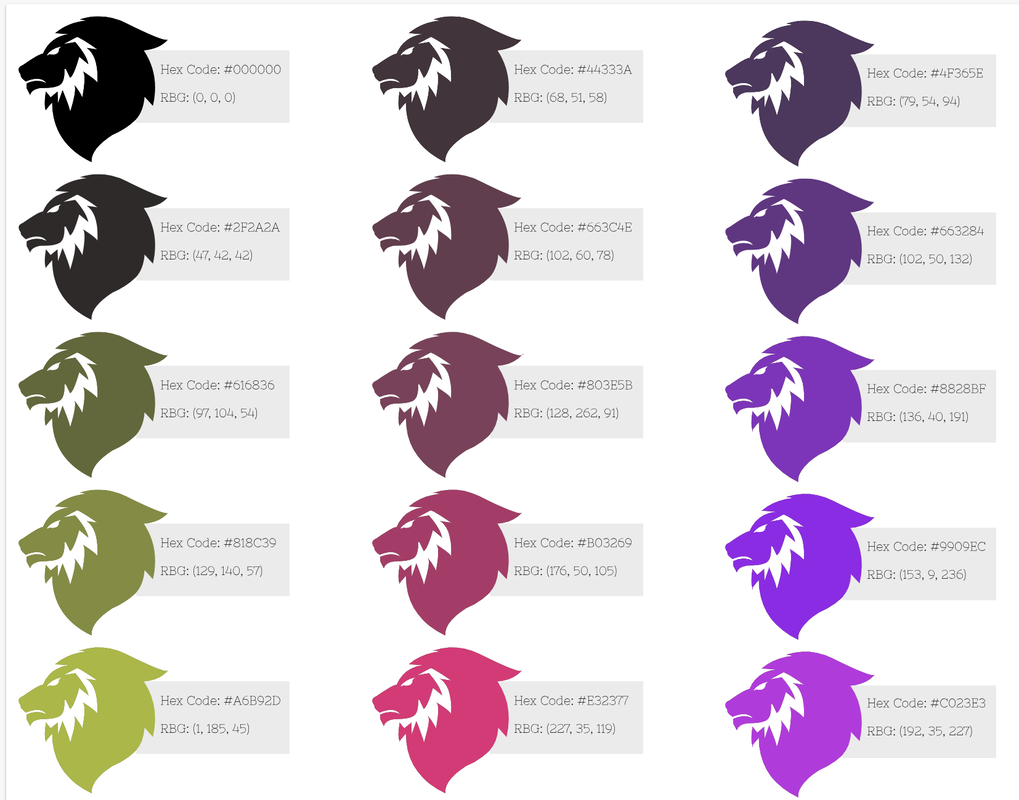 Typography is using different font types to make written language distinct, readable, and engaging when displayed. Typography is important because whatever fonts and sizes you use effect whatever you are working on. Whether preforming a presentations or creating a product website the typography matters. "Each font has a personality and a purpose." This means that every font you use represents something and it does matter what font you decided to use. You want the audience to be able to read what you wrote, she want to read more and it should be colorful. Typography allows you to highlight important things and main ideas. Many designers use typography when creating a movie poster, the title has to be big and readable. The font of the title has to also be related to the movie. The actors in the movie aren't written as big because they are less important and are not the main focus. Overall Typography is important when doing anything! In class we learned about Serif, San Serif, Monospaced, Script/Handwritten and Novelty fonts. Serif fonts are fonts that are used more when writing large paragraphs and are usually used in print. Serif fonts have "feet"which are lines at the bottom of the letters. The font I am using write now is a Serif font. The next type of font is Sans Serif. Sans Serif fonts are usually used for heading and small blocks of writing. Sans serif fonts unlike the serif fonts do not have "feet." Another type of font I learned about was Monospaced. When writing in monospaced each letter takes the exact same amount of space. They are better for titles and not large amounts of text. This type of font is usually used in coding because it looks neat and it is easy to read. Handwritten/ Script is my favorite font and is the 4th type of font we learned about in class. Script fonts include cursive, calligraphy, or handwritten. They are sometimes hard to read, cursive especially because of all the loops. These types of fonts are usually used for titles, headlines and are very detailed. The last type of font is Novelty. Novelty fonts are fun and peculiar fonts. Novelty fonts are very easily spotted because of the unique designs. They are not good for large amounts of text but are good for adds, and headings. Typeface ComparisonIn the typeface comparison assignment we were supposed to show our understanding of the 5 different types of fonts and become comfortable with typography. For this assignment we were supposed to find examples of each of the 5 fonts, give an example text of the font, and write the fonts name. We had to be able to tell each font apart and know what category they fit in. We also had to be able to space out everything evenly, and correctly. As you can see below I had the 5 different types of fonts, I wrote the name, I made an example of the font and I spaced everything out evenly. 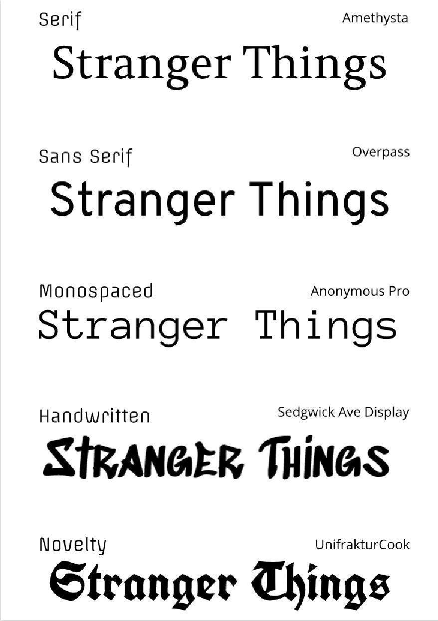 Word PortraitsIn this assignment we were supposed to get comfortable with the Type Tool, explore font options, and choose fonts that give meaning to text. We had to choose a font, write a word that matched the font and a word that opposes the font. We had to do this for 10 different fonts. The document we created it on had to be A4 sized, the layout had to be neat and creative, you had to label each font, and get it approved by the teacher. We also had to make sure that it was spaced out correctly and looked neat enough to submit. 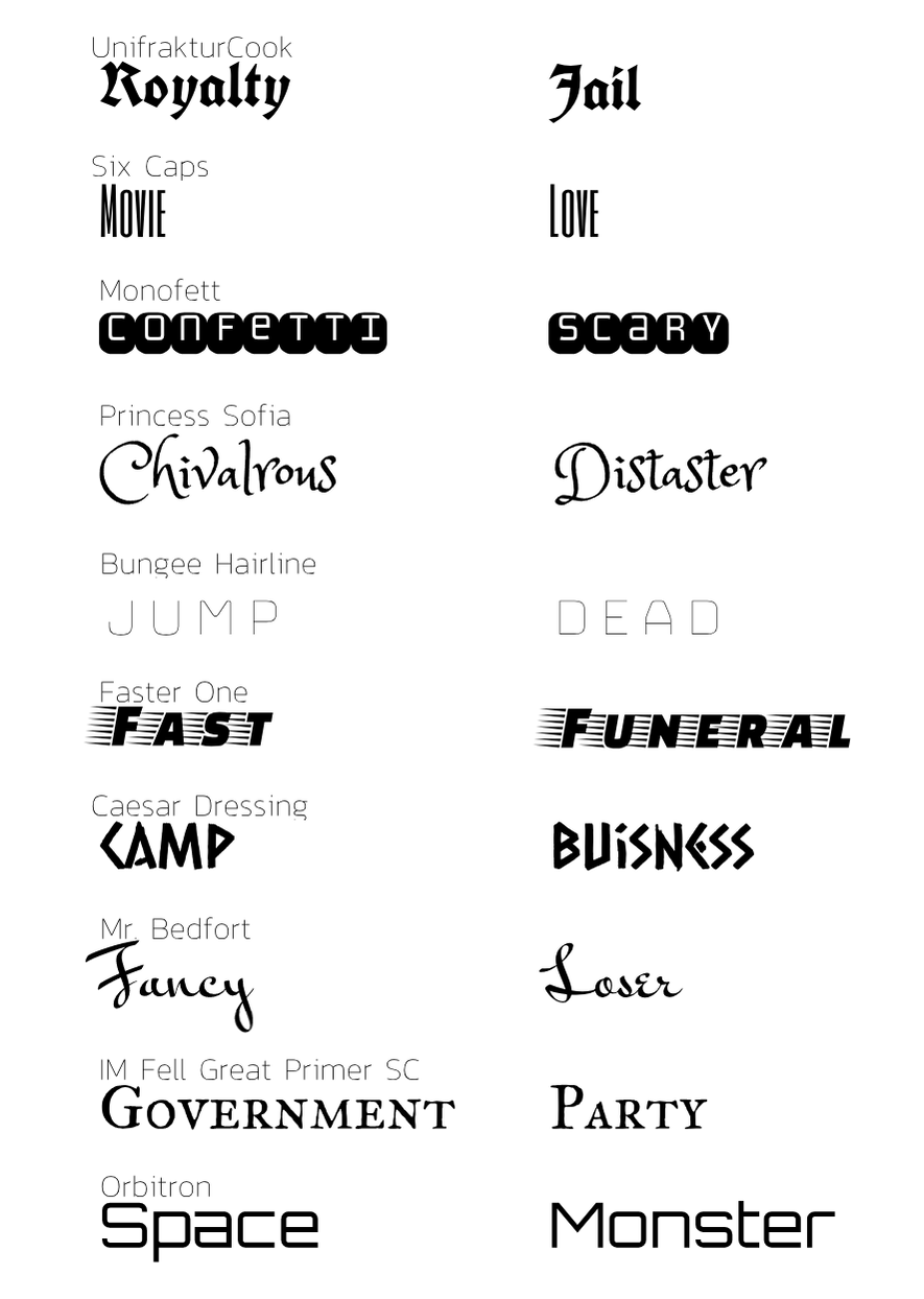 |
Archives
February 2019
Categories This work is licensed under a Creative Commons Attribution-NonCommercial-ShareAlike 4.0 International License. |
 RSS Feed
